
Is the S&P 500 Really All You Need?
Why Concentrating Everything in U.S. Large-Cap Stocks Is a Risk Most Investors Are Not Prepared For
If you spend any time in personal finance communities online, you have probably encountered the “VOO & Chill” crowd. The pitch is seductively simple: buy an S&P 500 index fund, hold forever, ignore everything else, and get rich. Why complicate it? The S&P 500 has crushed pretty much everything over the past 15 years. What more evidence do you need?
Quite a bit, actually.
And while we’re at it: this same crowd tends to be loudly, confidently against paying advisory fees. (More on that another time.)
The “just buy the S&P 500” strategy isn’t wrong because index investing is bad. Broadly diversified, low-cost index investing is one of the best things that happened to retail investors in the last 50 years. It’s wrong because it conflates an index fund with the only index you need. Concentrating everything in U.S. large-cap stocks is a real, identifiable risk. And history has handed us the receipts more than once. (Repeatedly. With interest.)
Let’s walk through it.
1. The Story the Last Decade Tells Is Not the Only Story
First, a quick vocabulary note. When people say “the S&P 500,” they mean an index of roughly 500 of the largest publicly traded companies in the United States, most of them household names: Apple, Microsoft, Amazon, Nvidia, and so on. When you buy a fund that tracks the S&P 500, you essentially own a small slice of all of them at once. It’s a good idea, as far as it goes. The problem is the “as far as it goes” part.
It’s easy to understand why U.S. large caps look unbeatable right now. The S&P 500 delivered extraordinary returns through the 2010s and into the early 2020s, largely driven by a handful of mega-cap technology companies. If you owned an S&P 500 fund from 2010 to 2024, you were richly rewarded. International markets, emerging markets, small caps, and value stocks all lagged by comparison. It felt obvious: why own anything else?
That kind of thinking has a name: recency bias. It’s the tendency to assume that whatever has worked recently may keep working indefinitely. Think of it like driving while staring in the rearview mirror. The road behind you looked great. That says nothing about what’s ahead. In investing, recency bias tends to be one of the most expensive cognitive shortcuts you can make. (And to be clear, everyone makes it. The question is whether you catch yourself before it costs you.)
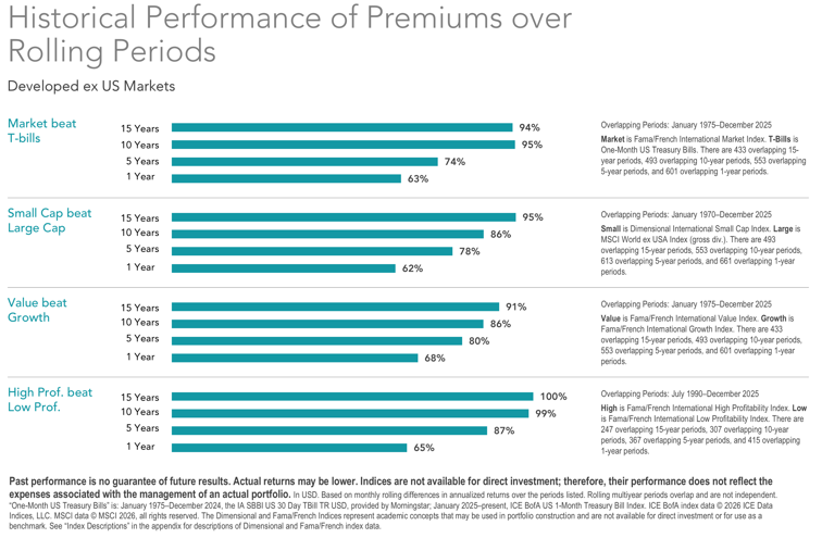
The historical record tells a more complicated story. According to Morgan Stanley Investment Management, international stocks have outperformed U.S. markets in four separate decades since World War II: the 1950s, the 1970s, the 1980s, and the 2000s. During those cycles, international stocks beat U.S. returns by a median of roughly 4.9% per year.[1] The current stretch of U.S. dominance is not the rule. It’s the exception. (An unusually long one, which is kind of the point.)
“The four most dangerous words in investing are: this time it’s different.” — Sir John Templeton
2. The Lost Decade: A Preview of What Concentration Can Cost You
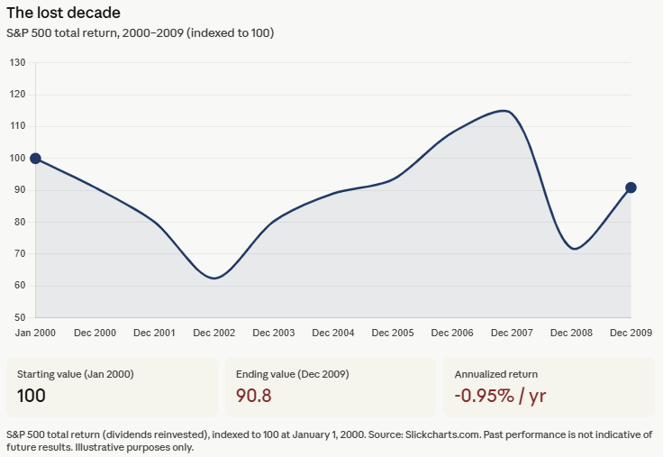
The most recent example of what happens when U.S. large caps hit a wall is the 2000s, a period frequently called the “lost decade” for U.S. investors. The S&P 500 ended 2009 at roughly the same level it started in 2000. Zero price growth across an entire decade. When you factor in inflation, meaning the rising cost of everything around you, investors who went all-in on the index lost real purchasing power over that stretch.
What happened? Two brutal crashes. The dot-com crash starting in 2000 wiped out a wave of massively overvalued technology companies. Then the financial crisis of 2008 hit. The S&P 500 dropped roughly 49% from peak to bottom in the first crash, and roughly 57% in the second. (To put that in perspective: a 49% drop means you need a roughly 98% gain just to get back to where you started. And that’s before the second crash hit.) Investors who had loaded up on U.S. large and mega-cap growth stocks heading into 2000 got hit especially hard, because those were the most overvalued sectors going in. Sound familiar?
Meanwhile, investors who held international developed markets and emerging market stocks fared considerably better. International developed markets outpaced the S&P 500 for much of the decade, and emerging markets, those of countries like Brazil, India, China, and South Korea, performed even more strongly during parts of that period.[2] The diversified investor wasn’t celebrating, but they weren’t devastated either.
This is not ancient history. Anyone who retired in 2000 with a portfolio concentrated in U.S. large caps experienced what’s called sequence-of-returns risk at its most punishing: they were pulling money out of a portfolio that was falling hard in the early years of their retirement, which may permanently affect long-term financial security. And they didn’t get a warning. Nobody does.
3. Japan: The Cautionary Tale That Never Gets Old

For those who think extreme single-country concentration is only a theoretical concern, I give you Japan.
In the late 1980s, Japan was the investing world’s darling. Its economy had expanded at a remarkable pace for three decades. Japanese companies were buying American landmarks. The Nikkei 225, Japan’s rough equivalent of the S&P 500, gained more than 224% between 1985 and 1989 alone.[3] By late 1989, eight of the world’s top ten companies by market value were Japanese. Tokyo real estate had become so inflated that the grounds of the Imperial Palace were reportedly worth more than all of California. The general feeling, as one writer put it, was that the Japanese economic takeover of the world was inevitable.
You can probably guess where this is going.
The Nikkei peaked at 38,915 on December 29, 1989. It then fell nearly 80% from that peak over the following years and did not recover to that same level until 2024. That’s 34 years.[4] For most of that stretch, a Japanese investor who had put money into the Nikkei earned approximately 1.1% per year, and all of it came from dividends. The price of the index itself was essentially flat for three and a half decades.[5] Entire careers. Entire retirements. Flat.
The valuation context matters here. At the Nikkei’s 1989 peak, investors were paying roughly 60 to 70 times the annual earnings of those companies to own them. The global average at the time was around 15 to 16 times earnings.[6] Japanese stocks were priced at roughly four times what stocks elsewhere in the world cost, relative to what those companies actually earned. (Any of this sounding familiar yet?)
The lesson from Japan is not that this is likely to happen to the U.S. It is that it has happened, that it can happen, and that investors who assumed their home market was permanently exceptional paid an enormous price for that assumption.
4. Current U.S. Valuations Are Not Exactly a Bargain
Speaking of how much investors are paying relative to what companies earn.
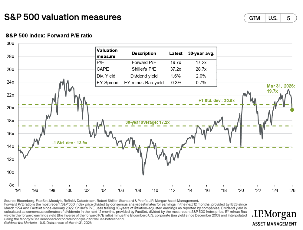
One of the most widely used long-term valuation measures is something called the Shiller CAPE ratio. (CAPE stands for Cyclically Adjusted Price-to-Earnings. It’s a mouthful, so most people just call it the CAPE.) Instead of just looking at one year of earnings, it averages ten years of inflation-adjusted earnings to smooth out the natural ups and downs of the business cycle. The idea is to get a cleaner read on whether stocks are historically expensive or cheap.
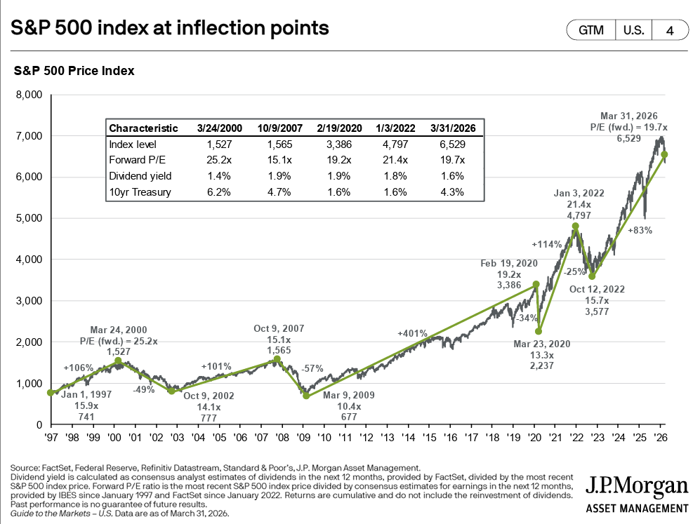
According to J.P. Morgan Asset Management’s Guide to the Markets, as of March 31, 2026, the S&P 500’s Shiller CAPE ratio sits at 37.2x. The 30-year average for that same measure is 28.7x.[7] In other words, by this measure the market is trading at a roughly 30% premium to its own three-decade norm. The forward P/E ratio, which looks at expected earnings over the next twelve months rather than a historical average, sits at 19.7x versus a 30-year average of 17.2x. It currently sits just below the upper one standard deviation band of 20.5x, and was recently above it.7 (That matters: the market has only spent a relatively small portion of the last 30 years above that line.)
To be clear: elevated valuations don’t predict exactly when things may change or by how much. They are notoriously poor short-term timing tools. But research spanning decades of market data suggests that starting valuations are among the stronger predictors of what returns may look like over the next ten years. Higher starting valuations have historically corresponded with more modest returns over the decade that followed.[8] (Not doom and gloom. Just math.)
And by comparison? International developed market stocks were trading at a roughly 40% discount to U.S. stocks at the end of 2024, when you look at the same valuation measures. International small-cap stocks were nearly 30% below their own 20-year average and at an all-time low valuation relative to U.S. large caps. Emerging market stocks sat at a steep discount too.[9] In other words: all of the asset classes that the VOO & Chill crowd tends to skip were, at this particular moment in time, considerably cheaper than what they were choosing to concentrate in. (Worth noting.)
5. You Are Leaving Real Return Drivers on the Table
Here’s something that often gets lost in the “just buy the S&P 500” conversation: the S&P 500 is not a neutral, comprehensive exposure to stocks. It’s a specific bet on large and mega-cap U.S. companies, heavily weighted toward technology and growth. By owning only that, you are actively excluding return drivers that decades of academic research suggest are real and persistent.
In 1992, economists Eugene Fama and Kenneth French published research showing that two additional characteristics beyond just “own stocks” explain a large chunk of why some portfolios have outperformed others over time.[10] The first is size: smaller companies have historically outperformed larger ones over long periods. The second is value: companies that are cheap relative to what they actually own or earn have historically outperformed more expensive, high-flying “growth” companies. Later research added a third factor, profitability: companies with strong, durable profits have tended to outperform weaker ones. (Fama won the Nobel Prize in Economics in 2013, partially for this work. It’s not a fringe idea.)
In plain English: history suggests that owning smaller, cheaper, more profitable companies alongside large ones has tended to produce stronger long-term results than owning only the biggest, most expensive ones. The S&P 500 is almost entirely the biggest, most expensive companies in one country. It’s roughly the opposite of what the research points toward.
The size premium, meaning the extra return small-cap stocks have historically delivered over large caps, has averaged roughly 1.5% to 3.5% per year going back to 1926 in U.S. data. The value premium has averaged roughly 3% to 5% per year.[11] These don’t show up every year. But over decades, they tend to compound. Ignoring them entirely isn’t a neutral choice. It’s a bet against them.
Dimensional Fund Advisors has built its entire investment approach around systematically tilting toward these kinds of companies, while staying broadly diversified. Over the 20 years ending December 31, 2022, more than 92% of their funds outperformed their benchmark indexes, compared to roughly 30% of the broader fund industry.[12] That difference is not a coincidence.
The investor concentrated entirely in U.S. large caps isn’t just ignoring other countries. They’re actively betting against decades of research by concentrating in the largest, most expensive companies in one market. (And the fee savings from skipping an advisor to get there don’t exactly cover that tradeoff.)
6. You Cannot Rebalance What You Do Not Have

One of the underrated advantages of holding multiple asset classes is what diversification lets you do during volatile markets: rebalance.
Rebalancing just means periodically trimming the parts of your portfolio that have grown and adding to the parts that have fallen. If your international stocks drop 20% while your U.S. stocks hold steady, rebalancing means shifting some money from U.S. stocks into international, buying more of what got cheaper. It sounds obvious. In practice, it’s psychologically brutal because it requires buying the thing that just fell, which feels terrible. That’s exactly why it tends to add value: most people won’t do it.
When international stocks were getting crushed in 2011 and 2012, an investor with a diversified portfolio could systematically shift money toward them at lower prices. When U.S. small caps lagged badly in the early 2000s, the diversified investor was buying them on sale. Both positions eventually recovered and then some.
An investor who only owns an S&P 500 fund has nothing to rebalance into. There’s no other bucket to draw from, and no underperforming asset class to add to at a discount. Every market swing is just a passive ride. You eliminate one of the few systematic, evidence-based advantages available to long-term investors. (And then potentially panic sell at the bottom. Which is its own expensive problem.)
The concept is simple: the less your asset classes move in lockstep with each other, the more rebalancing may benefit you. U.S. stocks, international stocks, small companies, value companies, and emerging markets each tend to respond differently to different economic environments. That’s a feature. Not a bug.
7. The “All You Need” Narrative Already Has Cracks in It
One of the most persistent arguments for the S&P 500-only approach is that it’s simply worked. And for the last 15 years, that’s been largely true. But zoom out even a little, and the narrative starts to look shakier than the Reddit threads suggest.
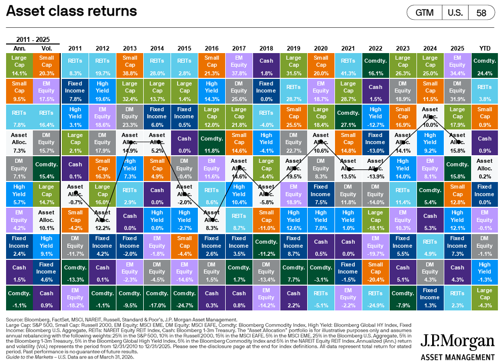
Take 2025. The S&P 500 had a strong year, finishing with a total return of roughly 18%.[13] A well-diversified portfolio would have owned that. But it also could have owned international small-cap stocks, which finished the year at roughly 33%, and emerging market stocks, those in developing economies like India, Brazil, and parts of Asia, which also finished at roughly 33%.[14] (That’s not a typo.) An investor who only held the S&P 500 captured none of those additional return sources. An investor who held the S&P 500 alongside a broader mix had exposure to all of them.
The point isn’t that one portfolio configuration “won” 2025. It’s that concentrating entirely in the S&P 500 meant leaving additional return sources completely off the table in a year when they happened to perform well. That’s what concentration tends to cost you: not always, not in every year, but sometimes, and often when you least expect it.[15]
The “all you need is an S&P 500 fund” argument tends to rely on a very specific, very recent window of data to make its case. The moment you step outside that window, the argument gets a lot less convincing.
8. Concentration Risk Is Hidden Inside the Index Itself
Here’s a wrinkle that surprises a lot of people: even within the S&P 500, the “500 companies” label is a bit misleading in terms of actual diversification.
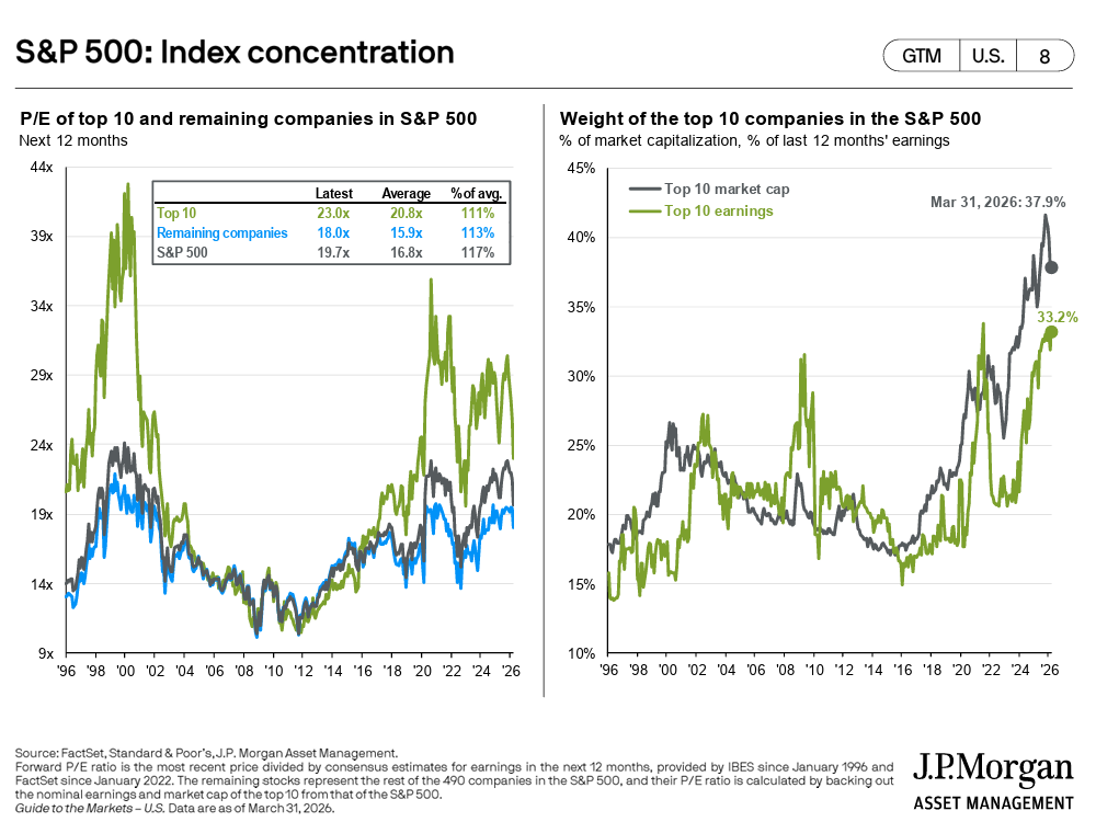
The S&P 500 is what’s called a market-cap weighted index. That means the bigger a company is, the more of the index it represents. It’s not 500 equal slices. It’s 500 companies where the largest ones carry a dramatically disproportionate share of the weight. As of 2025, the top ten companies alone accounted for roughly 40% of the entire index.[16] So when you buy an S&P 500 fund, about 40 cents of every dollar you invest is going into just ten companies, most of them in the technology sector.
When Nvidia, Apple, Microsoft, Meta, and a few others are collectively worth as much as the remaining 490 companies combined, you are not holding a diversified basket. You are holding an index that moves largely with the fortunes of a very small number of businesses in a single sector. (You can own all 500 companies and still be highly concentrated. That’s a feature of market-cap weighting that doesn’t get nearly enough attention.)
That concentration inside the index compounds the concentration risk that already comes from ignoring every other type of stock in the world. It’s concentration on concentration.
Putting It Together
None of this is an argument against index investing, against owning U.S. stocks, or against the S&P 500 as part of a portfolio. It’s a fine building block. The keyword there is “building block.”
The argument is against treating it as the complete structure.
A thoughtfully diversified portfolio, one that includes exposure to international developed markets, emerging markets, smaller companies, and value-oriented stocks alongside U.S. large caps, isn’t more complicated for its own sake. It’s built to capture multiple return drivers at once, rebalance opportunistically through market cycles, avoid excessive concentration in any single country, sector, or style, and not depend entirely on the continuing outperformance of one corner of one market.
History suggests that exclusive faith in any single market, at any price, is a plan that eventually gets tested. The Japanese investor in 1989 had a decade of evidence that their market only went up. The U.S. dot-com investor in 1999 had years of extraordinary returns that made the strategy feel obvious. The investor concentrating entirely in U.S. large caps today has a similar recent run to point to.
That’s not a track record. That’s a recent stretch of strong performance. And history has a way of eventually testing both.
(And as for the idea that you don’t need an advisor to help you think through any of this: the research on what good financial planning actually delivers doesn’t exactly support the “just buy VOO and skip the fees” thesis. If you’re curious, I wrote about it here.)
Sources
Morgan Stanley Investment Management. “The International Rebalance.” 2024. International stocks have outperformed U.S. markets in four separate decades since WWII — the 1950s, 1970s, 1980s, and 2000s — beating U.S. returns by a median of 4.9% CAGR during those cycles.
Larson Financial Services. “A Diversification Reminder: International Stocks Outperforming U.S. Stocks.” March 2026. From 2000–2009, international developed markets outperformed the S&P 500 by a wide margin; emerging markets performed even more strongly during parts of that stretch.
Wikipedia. “Japanese Asset Price Bubble.” The Nikkei 225 gained more than 224% from January 1985 to its peak on December 29, 1989, closing at 38,915.87.
Wikipedia. “Nikkei 225.” The index hit an intraday post-bubble low of 6,994.90 on October 28, 2008 — approximately 82% below its 1989 peak. It surpassed its 1989 closing high on February 22, 2024, 34 years later.
Money For the Rest of Us. “Japan’s 34-Year Market Underperformance.” Through end of January 2024, the MSCI Japan index returned approximately 1.1% annualized over the full period — all of it from dividends, with essentially zero price return.
A Frugal Doctor. “Japan’s Lost Decades: 30 Years of Negative Returns from the Nikkei 225.” At the Nikkei’s 1989 peak, the P/E ratio was approximately 60x trailing twelve-month earnings vs. a global average of roughly 15–16x.
J.P. Morgan Asset Management. “Guide to the Markets — U.S.” Q2 2026, as of March 31, 2026. S&P 500 valuation measures: Forward P/E 19.7x vs. 30-year average 17.2x; CAPE (Shiller P/E) 37.2x vs. 30-year average 28.7x; +1 standard deviation band 20.5x. Source: Bloomberg, FactSet, Moody’s, Refinitiv Datastream, Robert Shiller, Standard & Poor’s, J.P. Morgan Asset Management.
Invesco / Robert Shiller data. “Applied Philosophy: The Shiller P/E and S&P 500 Returns Revisited.” March 2025. CAPE ratio shows predictive power for 10-year forward returns with R-squared of approximately 0.78 (1983–2015 sample).
Artisan Partners. “International Small Cap: A Strategic Asset Class.” December 2024. At end of 2024, the S&P 500 was 50% above its 20-year average P/E multiple; the MSCI EAFE Small Cap Index was nearly 30% below its 20-year average P/E and at an all-time low valuation vs. U.S. large caps. Emerging markets trading at approximately 40% P/E discount to U.S.
Fama, Eugene F. and Kenneth R. French. “The Cross-Section of Expected Stock Returns.” Journal of Finance, 1992. “Common Risk Factors in the Returns on Stocks and Bonds.” Journal of Financial Economics, 1993.
Ryan O’Connell, CFA. “Fama-French Three-Factor Model: Beyond CAPM.” Size premium (SMB) historically approximately 1.5–3.5% annually in U.S. data since 1926. Value premium (HML) historically approximately 3–5% annually.
Dimensional Fund Advisors. “The Evolution of Small Cap Investing: Four Decades of Innovation.” August 2023. Over the 20 years ending December 31, 2022, 92% of Dimensional’s funds outperformed their prospectus benchmarks vs. approximately 30% industry-wide.
First Trust Advisors / RBC Wealth Management. “The S&P 500 Index 2025 Recap” and “U.S. Equity Returns in 2025.” January 2026. S&P 500 total return (including dividends) for full-year 2025 was approximately 17.9%.
MSCI Index Factsheet. “MSCI Emerging Markets Index (USD).” Full-year 2025 annual return: 33.57%. MSCI ACWI ex-USA Small Cap Value full-year 2025 return: approximately 33.26% (YCharts, as of February 2026).
MFS Investment Management. “International Large-Cap Value: The Forgotten Asset Class.” 2025/2026. The rolling five-year stretch of U.S. outperformance vs. EAFE Value as of December 31, 2024 was the longest in the past 40 years; the degree of relative outperformance had never been witnessed in history in terms of magnitude.
Visual Capitalist / Evaluator Funds. “The U.S. Stock Market vs. Rest of World (1979–2025).” As of 2025, the top 10 companies’ share of the S&P 500 accounted for approximately 40–41% of total index weight.
Disclosures
Fiduciary Financial Advisors does not accept any liability for the use of the information discussed. Consult with a qualified financial, legal, or tax professional prior to taking any action. Before investing, consider investment objectives, risks, fees, and expenses. Investments in securities involve the risk of loss, including loss of principal. Past performance is no guarantee of future returns. The views and opinions reflected in the content are subject to change at any time without notice. The content speaks only as of the date indicated. Some information was obtained from external sources. The information is believed to be accurate, but there is no guarantee that it is.
This content is for educational purposes only and does not constitute personalized tax, legal, or investment advice. Consult a qualified CFP®, CPA, or attorney before taking action.
Fiduciary Financial Advisors is a registered investment adviser. Nothing here constitutes individualized investment advice. Examples are illustrative only and not recommendations. No guarantee of future results. Third-party data is not independently verified.
CFP® and CERTIFIED FINANCIAL PLANNER® are certification marks owned by the CFP Board.